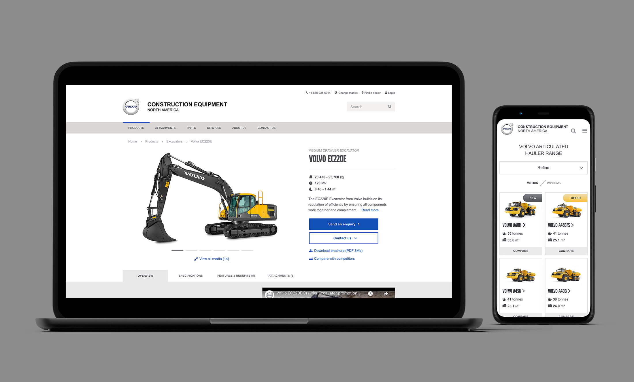
A complete product pages overhaul.
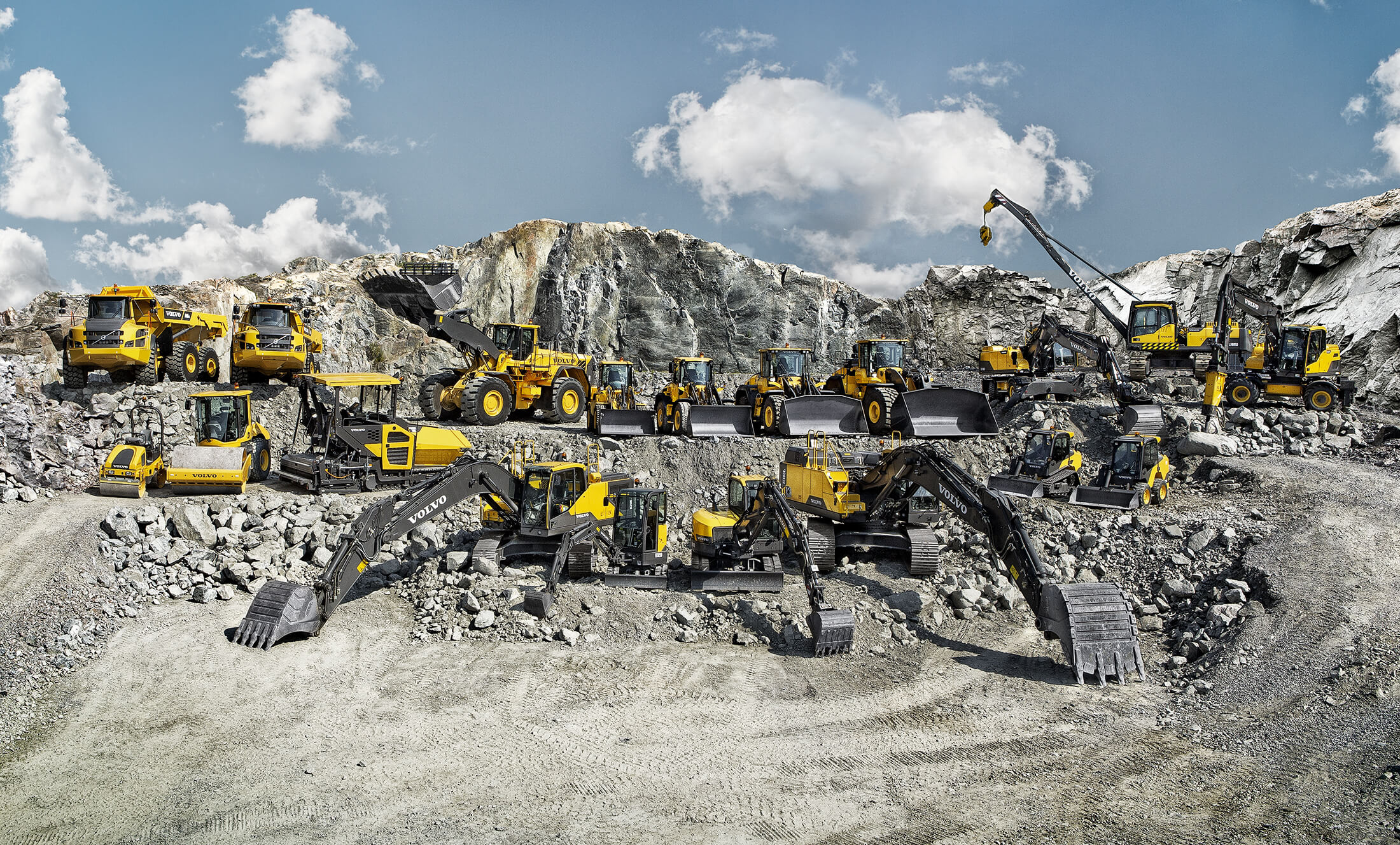
Volvo Construction Equipment is one of the world’s biggest heavy duty brand with excavators, wheel loaders and whatnot working in every corner of the planet. Their website, though, had some really troubling issues despite being one of the company's most important sales channels. I was co-lead designer for the team putting them back on track online.
Client |
Agency |
|---|---|
Volvo Construction Eq. |
Stendahls |
What I did |
More |
|---|---|
Digital Design, Art direction |
Before and after
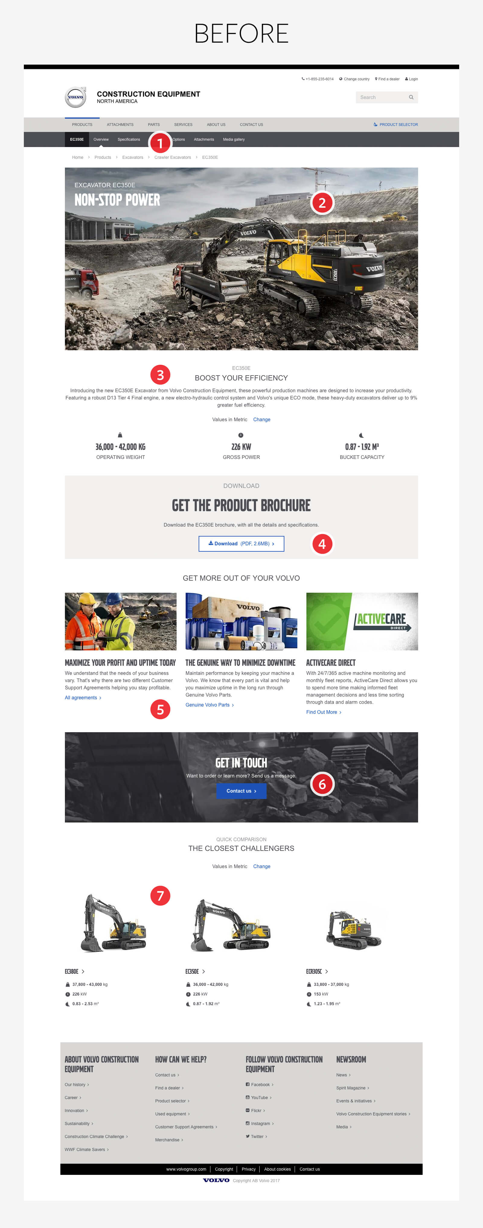
We re-designed the whole product part of the website – not just the individual model pages. These pages were then produced and populated for all of the company’s market and regional sites, in total over 60 separate sites. Shown below are some of the issues with the old version of a model page and what we did in the re-design to correct them.
Before
❶ A subnavigation so discrete and oddly placed that unfortunately no one sees it. One of the findings from our extensive analysis was that most visitors wanted to view the model’s specs but almost no one actually found it.
❷ The top of the model page was occupied by a big hero image along with generic copy.
❸ Full-width and centered text, not exactly web standard.
❹ This is the first call-to-action, well below the fold.
❺ These links has nothing to do with the product model.
❻ The secondary call-to-action is found way down here.
❼ Another finding was that many people used these links (leading to other product models) simply because they were irritated about not finding the information they wanted for this model.
After
❶ A half-page-width main studio image and a clear link to all images and videos (opens in a clean, dark modal view).
❷ We put all call-to-actions and important downloads at the page top and with a clear hierarchy. Close to the model name is also the main three specs, a short text describing the model and the possibility to move on to the previous / next product model.
❸ Nifty and obvious anchor-link tabs that becomes sticky at scroll together with the main call-to-action.
❹ The dealers needed a way to highlight offers etc related to a product model. This carousel made the trick of being around without disturbing the model info too much.
❺ This is actually what most visitors want to see – the technical specifications. The main specs are shown directly together withe links to the complete specs and a smart competitor comparison.
❻ The Features and Benefits are highlighted with expandable cards.
❼ No bucket, no digging. The attachment cards have a different grid and design to separate them from the feature-cards.
❽ We put in a good fight to exclude as many links as possible leading elsewhere on the site. This panel clearly labelled “Related” is an ok compromise.

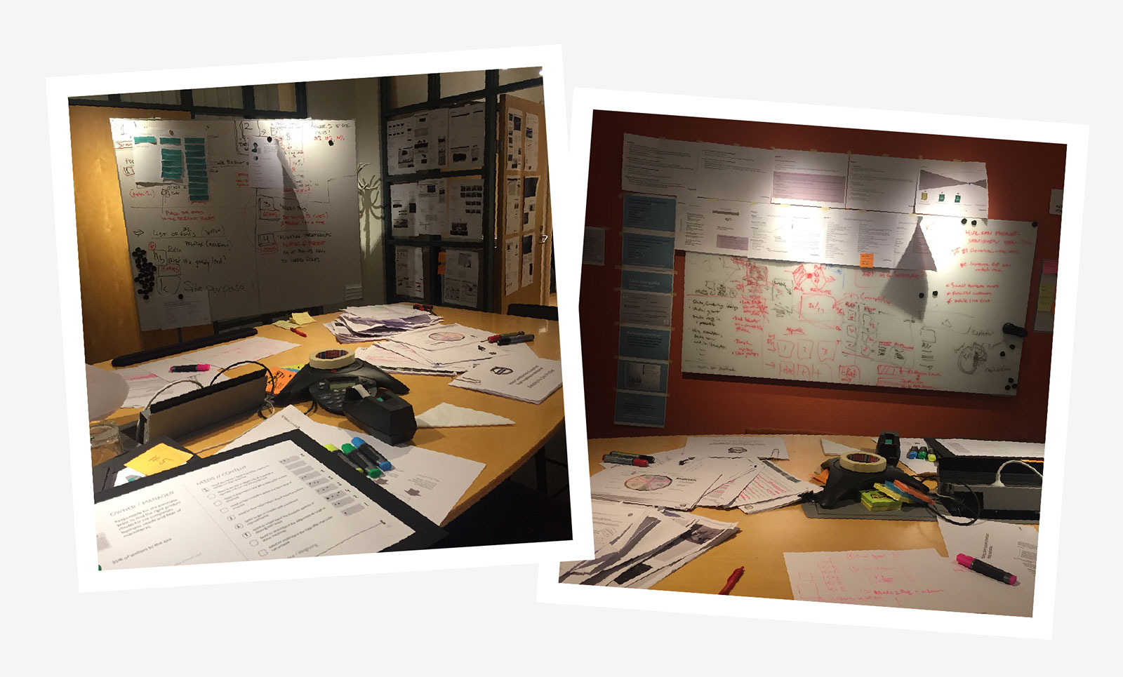
War room
The team at Stendahls made an excellent – and vast – pre study resulting in both quantitative and qualitative findings. Traffic analysis, interviews with stakeholders and site visitors, breakdowns of the old site, a benchmark study and so on.
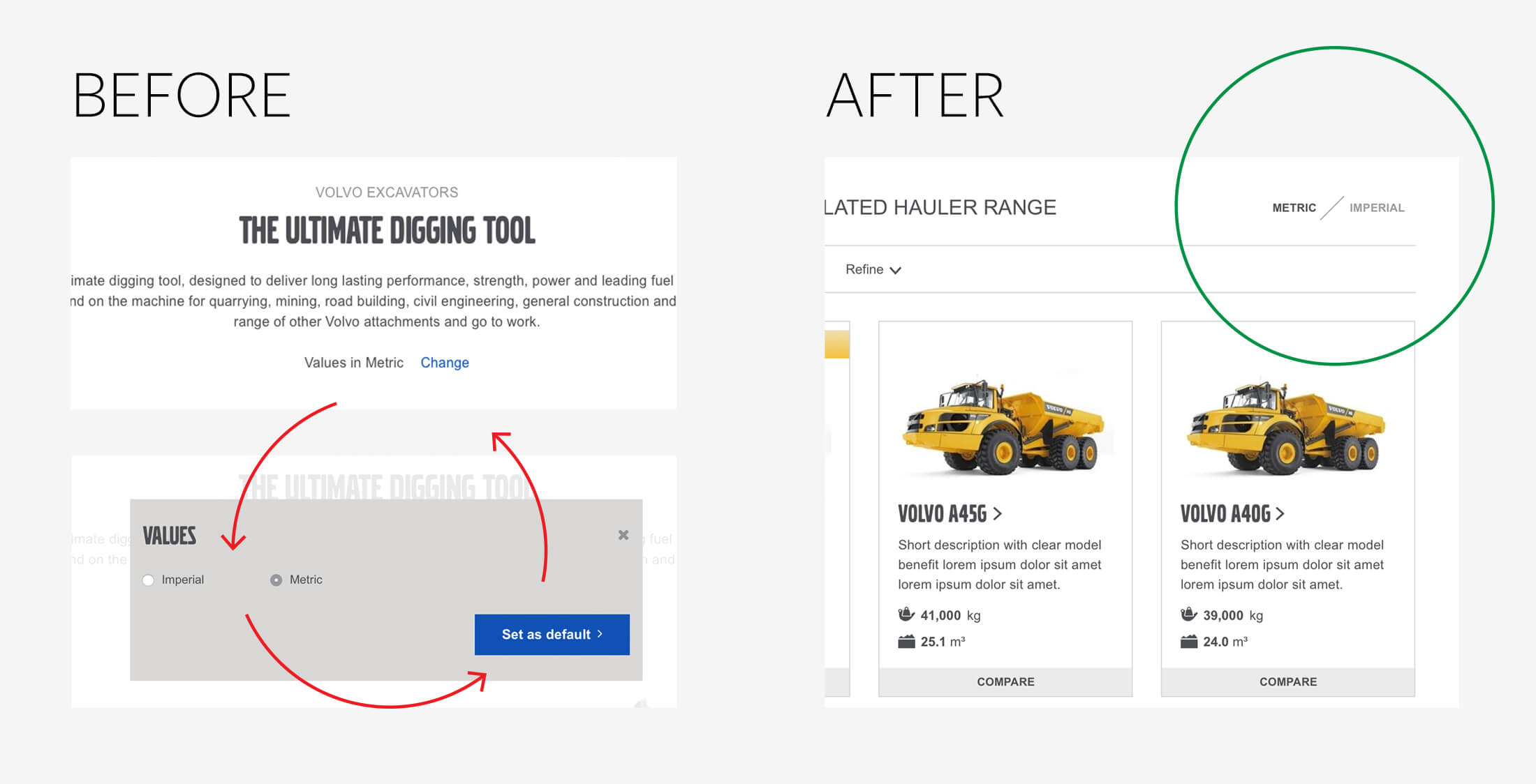
Details are important
The old site had a complicated and poorly designed three-click-way of changing between metric and imperial units via a modal view. Our simple one-click switch is sweet for those wanting their specs in pounds and inches.