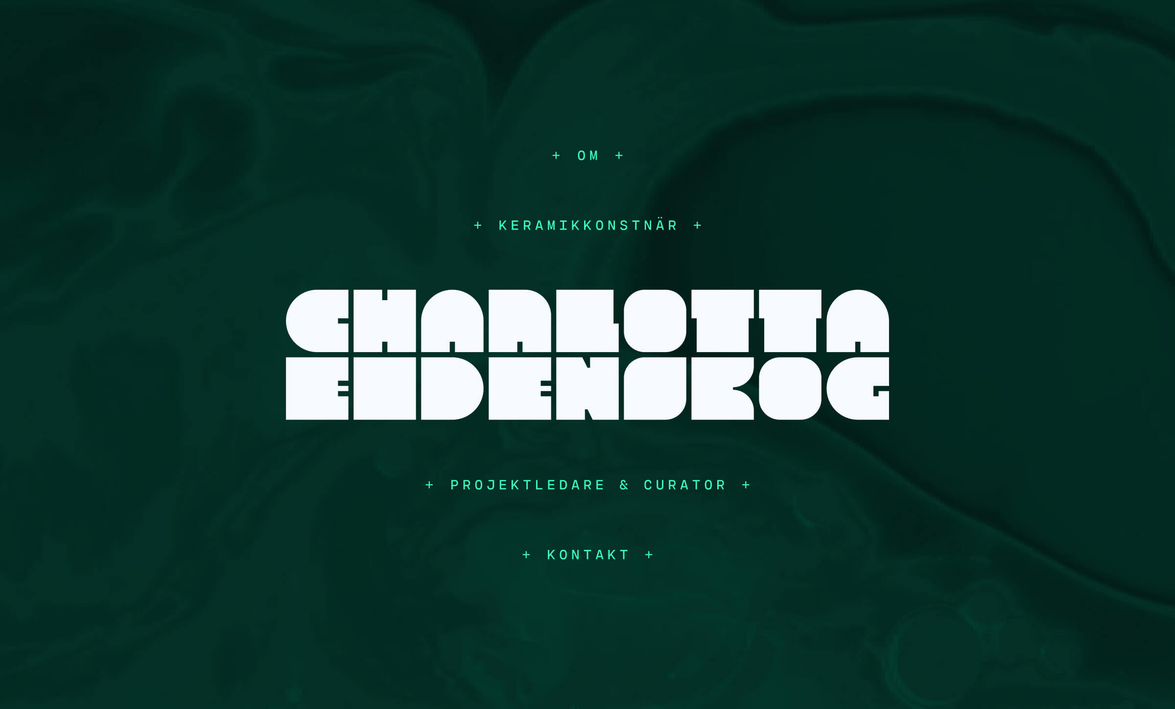
Bold visual identity and organic digital design.
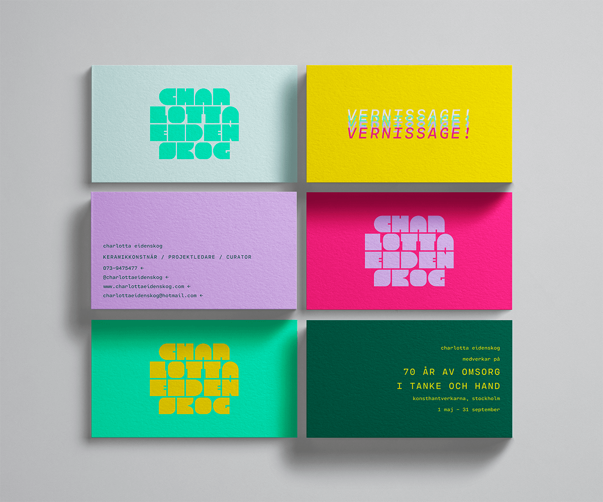
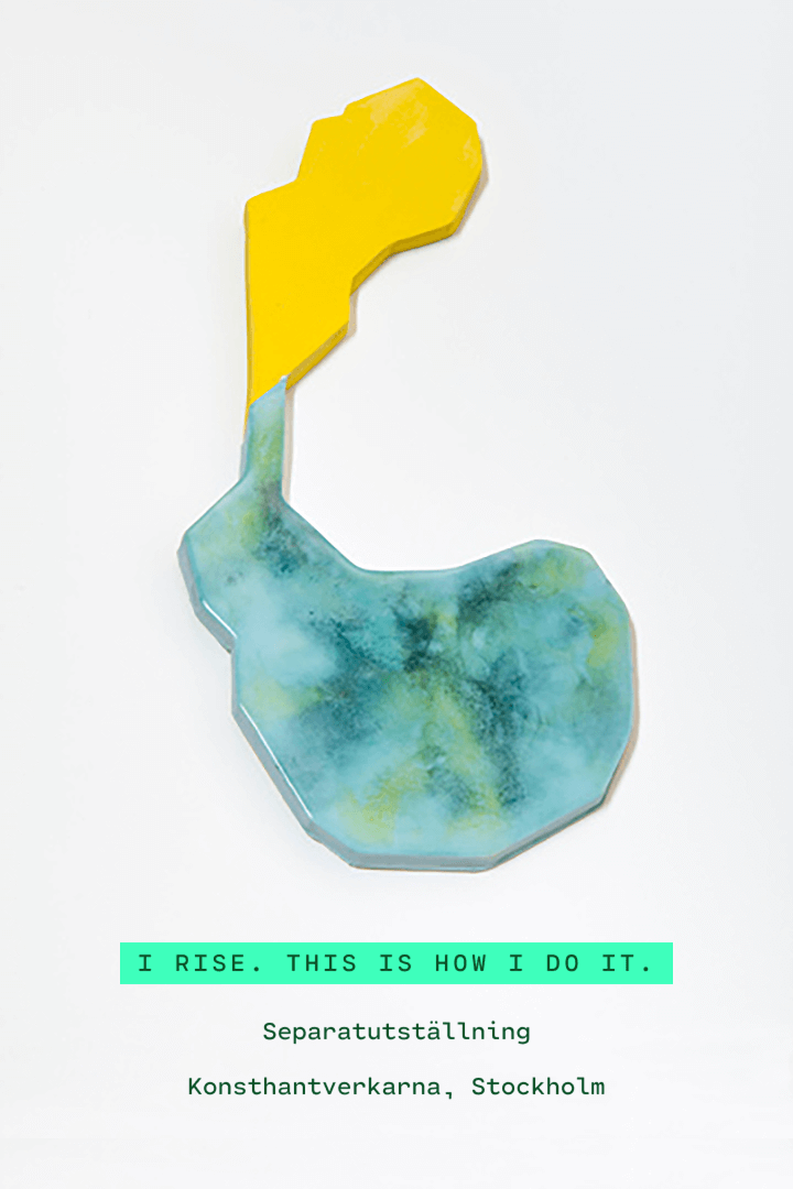
Ceramic artist Charlotta Eidenskog is working in a variety of styles and settings – from solo exhibitions to explorative co-labs and production of utility items. I created a strong visual identity that ties it all together. Currently I'm also working on a new website showcasing Charlotta's works and projects.
Client |
|---|
Ceramic artist Charlotta Eidenskog |
What I did |
|
|---|---|
Identity, Art direction, Digital design (WIP) |
Monospaced beauty
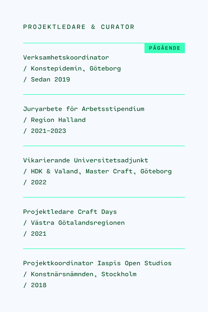
The font Cartograph by Connary Fagen is a perfect, strict complement to both the bold shapes in Charlotta's logo and the organic nature of her works. I love how well this monospaced font is crafted. Its unique details – shown for example in the comma, ampersand and zero – makes it a great font for identity use.
Subtle animations and effects
For Charlotta's website I want to add some organic movements such as a springy transition effect and a fluid video background. Not too much motion though, I do not want it to be messy. The same goes with the blur effect in the sticky TILLBAKA-button: the goal is a subtle, soft and natural effect that also helps the readability.
Aligning print with web
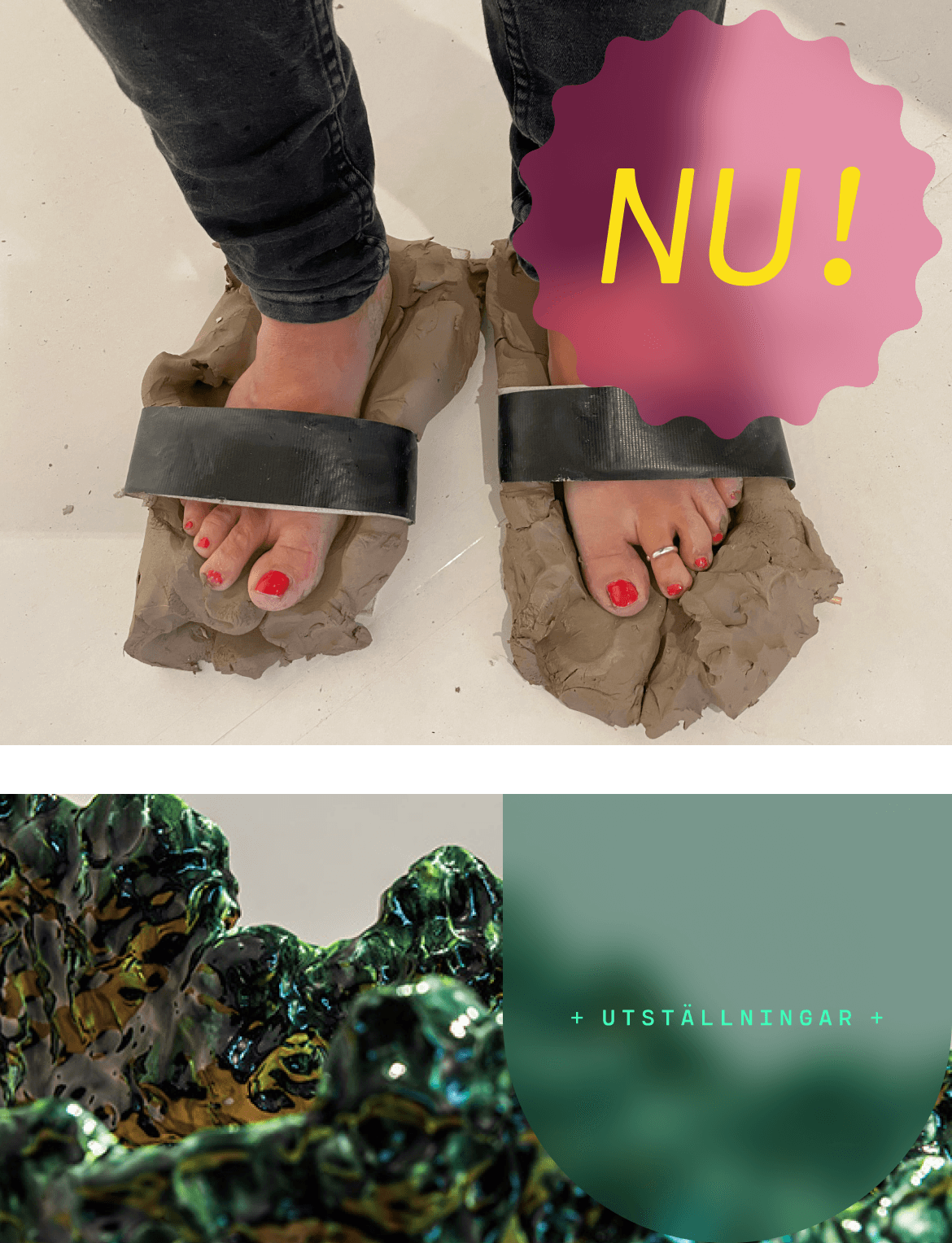
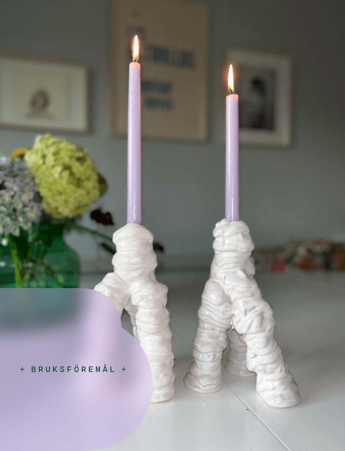
The blurred effect used in the digital design also translates well to still and printed communication, here in combination with bold shapes originating from the logotype's style.